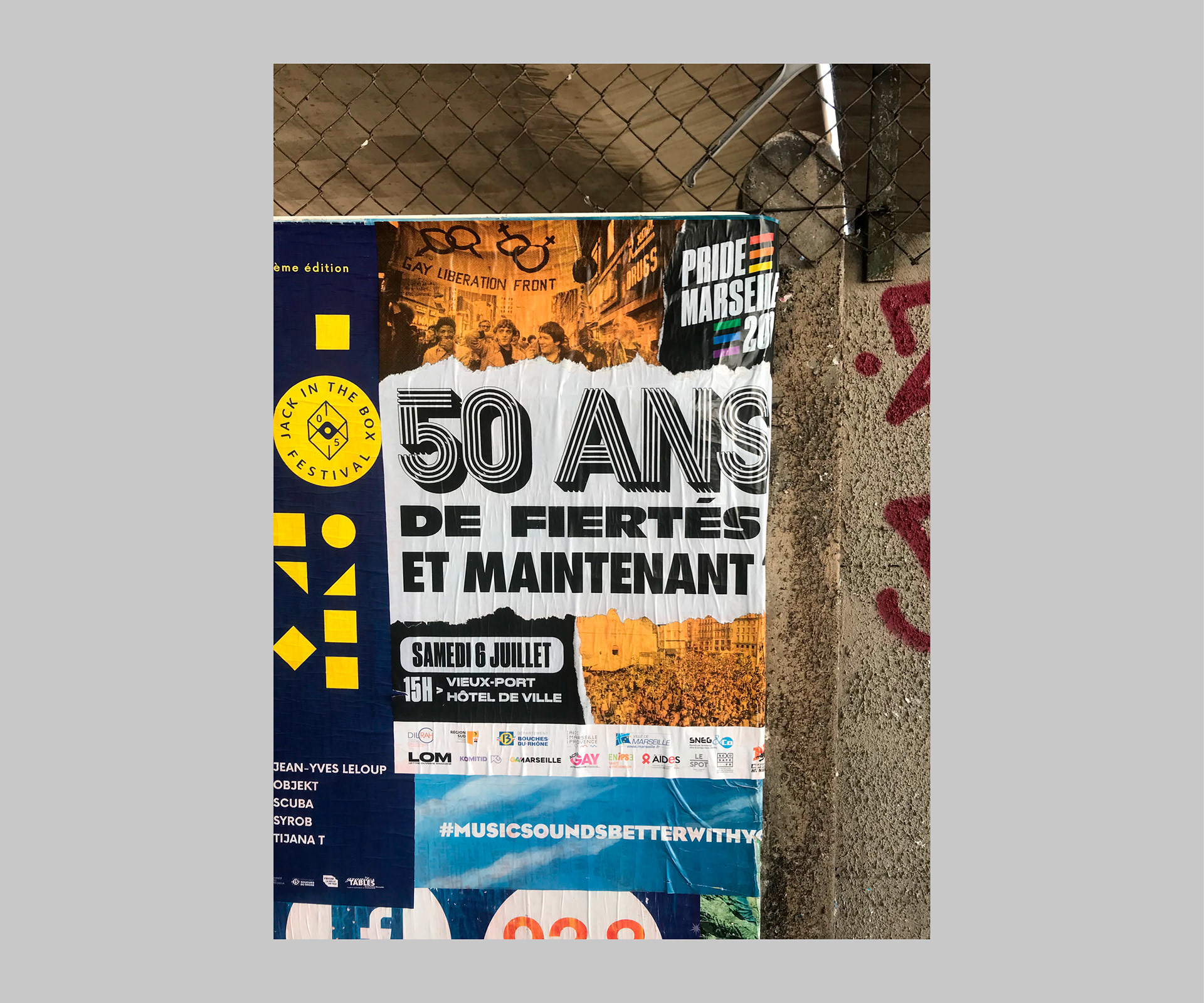
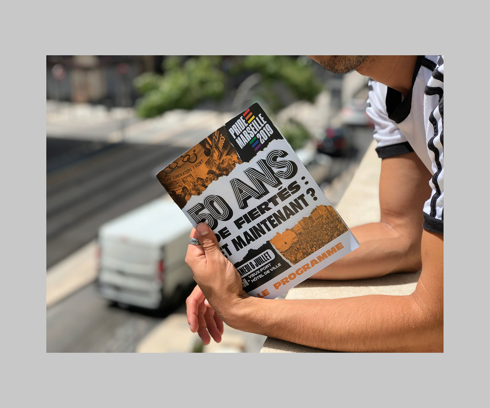
2019's Pride in Marseille (France) celebrates, as all the other Pride Marches in the world, 50 years of LGBTI+ History, from 1969 till today, from Stonewall's riots to nowadays marches for equality.
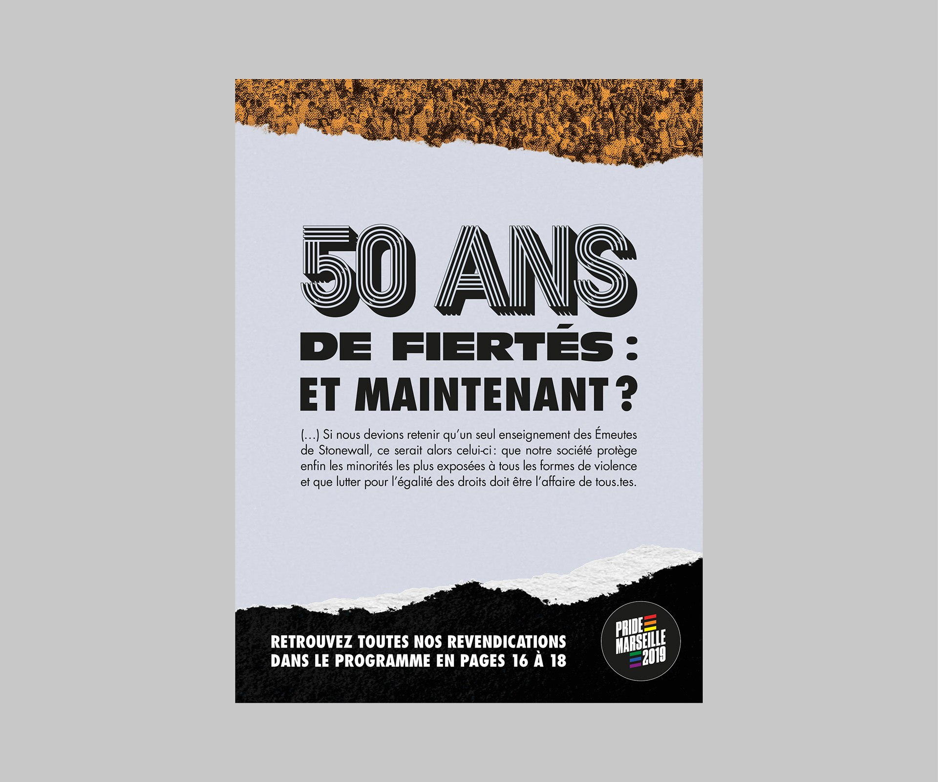
With the tagline "50 ans de fiertés: et maintenant?" ("50 years of prides: what about now?") the aim is to focus on the Past, but more than that, to focus on the Present, and the Future of LGBTI+'s History.
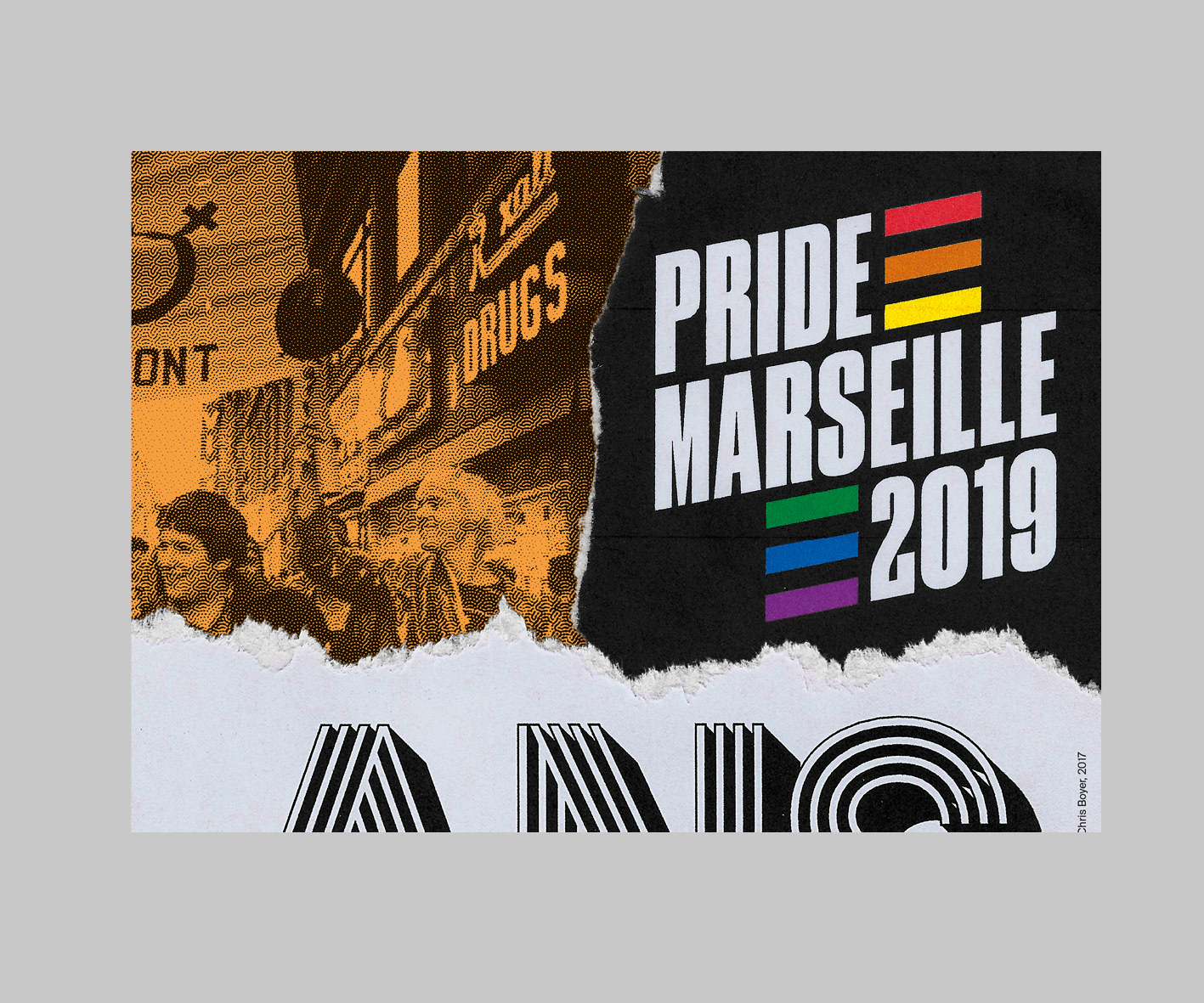
It has been a pretty tough task for me to give a look back at 50 years in one poster, the main element of Pride Marseille's visual identity. How to represent 50 years of photos, posters, boards, newspapers articles, so in fact, 50 years of archives?
Then, something came to my mind. This poster will be the 26th poster for Marseille's Pride, the 26th poster that will be stuck on walls, shops' windows, around the city. Basically, our History is not only in boxes of archives, it's on our walls. Layers and layers of posters are stuck on our walls every years, and if you tear one of them, you see the Past.
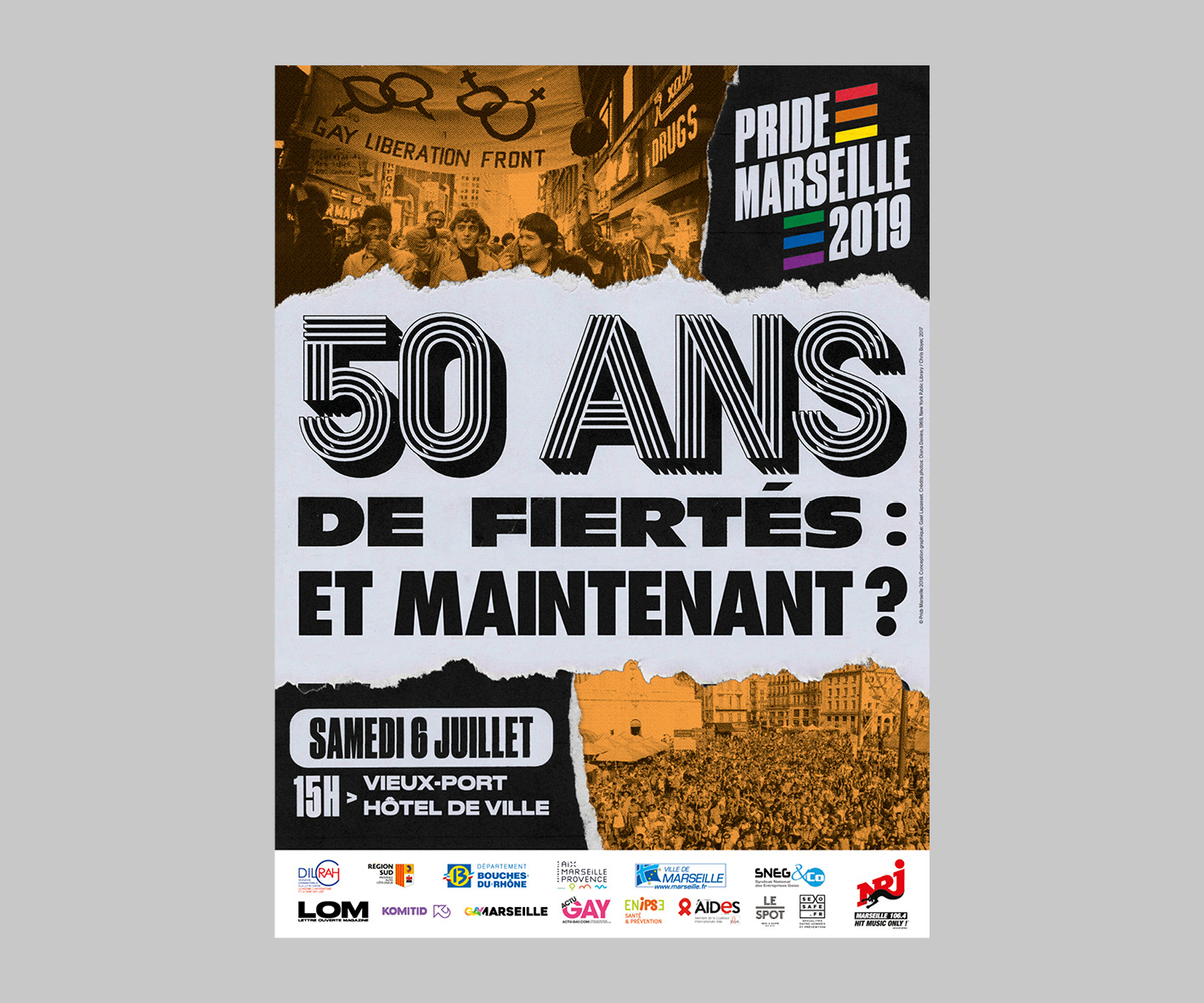
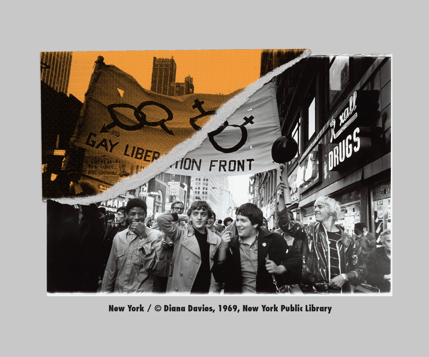
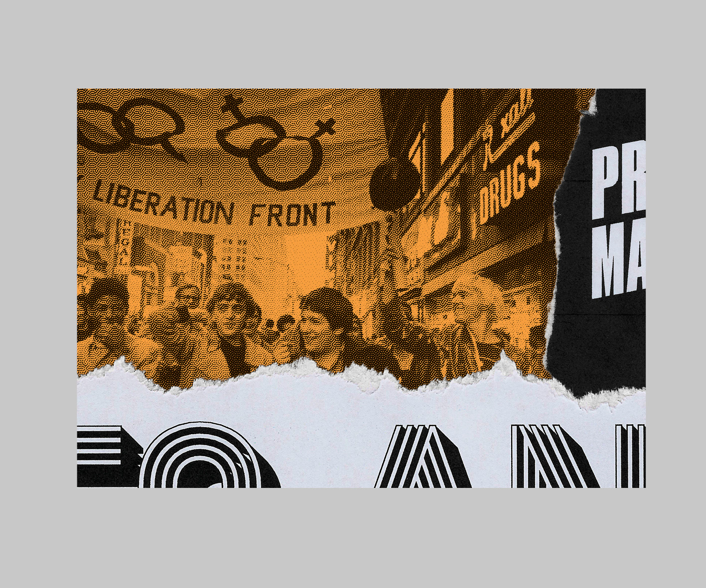
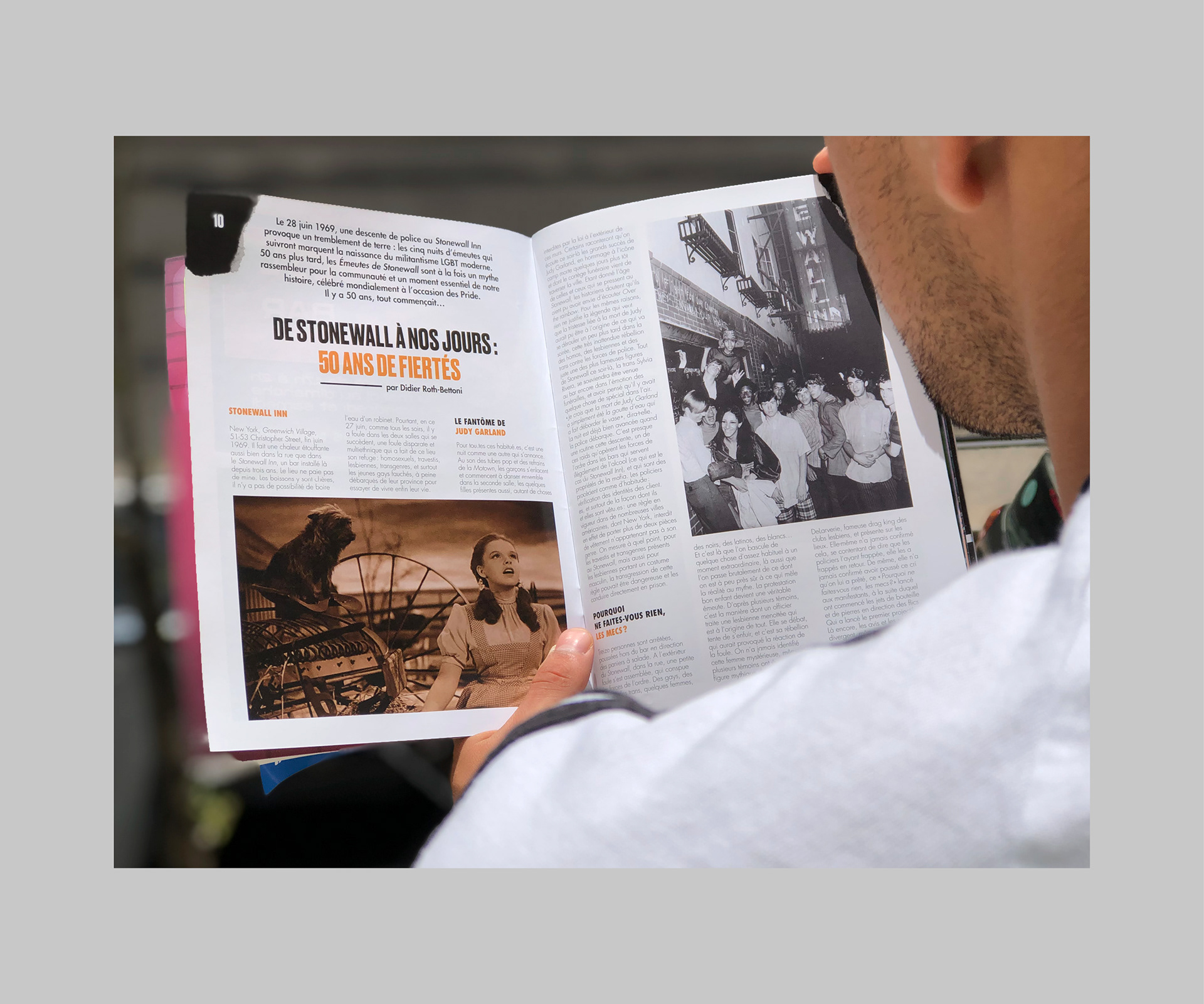
It's a real challenge to find pictures from Stonewall's riots. The few we have are not from the day it happened, but from days later, and are staged pictures from what really happened, for a simple reason: in 1969, who really wanted to see black people, latino people, gay people, trans people in newspapers? Minorities were hidden. It was a terrible time for press objectivity.
For that simple (and unfortunate reason), we decided to use this photo of the Gay liberation Front banner from a few weeks (months?) later in the streets of New York, by Diana Davies.
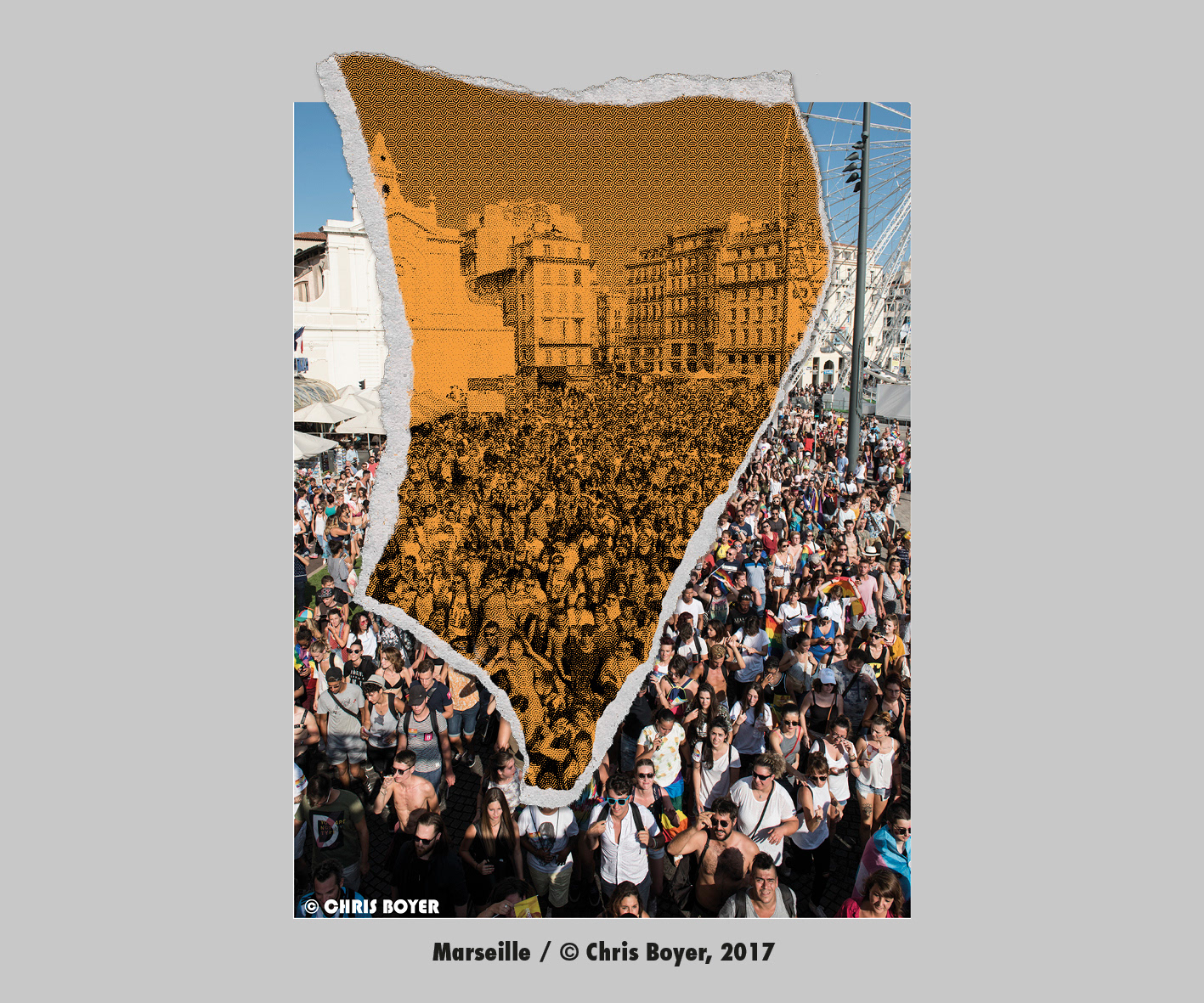
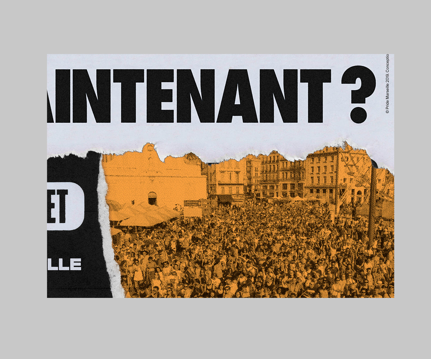
It was easier to find pictures from Marseille's Pride (of course), so we took this one, taken on the Vieux-Port (Old Port), one of Marseille's most famous places.
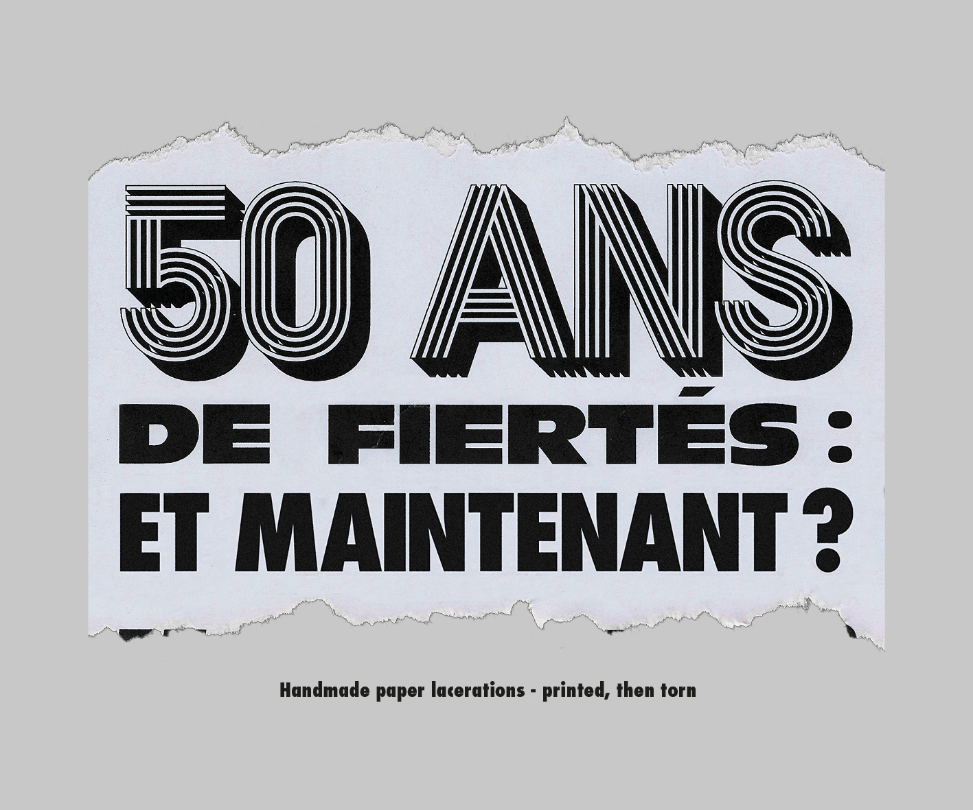
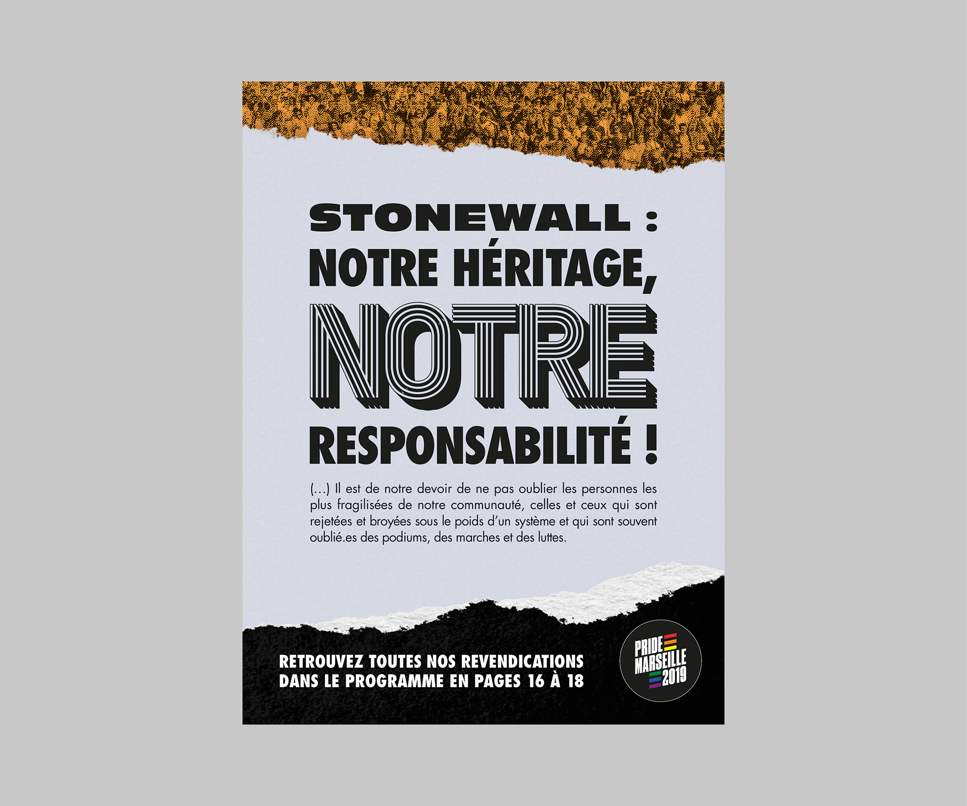
The poster is fully handmade. I printed pages, tore them, then scanned them to recreate the poster in high quality on my computer.
Let's talk about the typefaces. I am really proud of using them, as they represent many things for graphic design's History, for Marseille's History, and for my story haha.
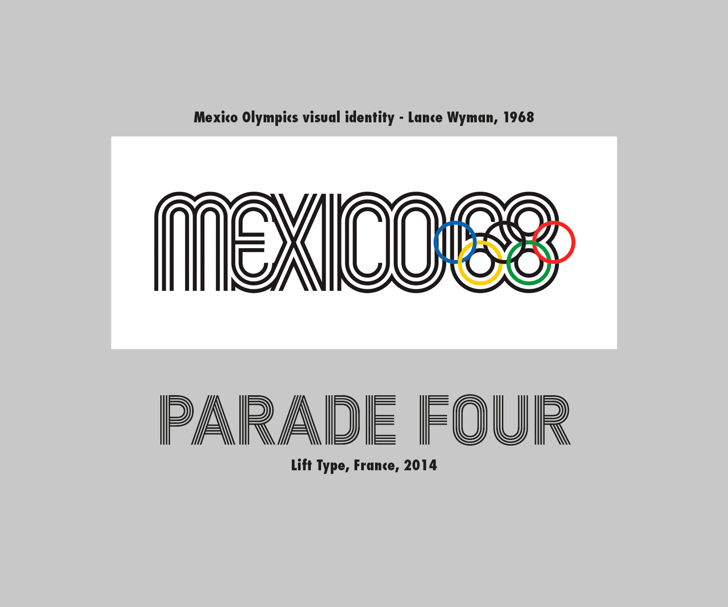
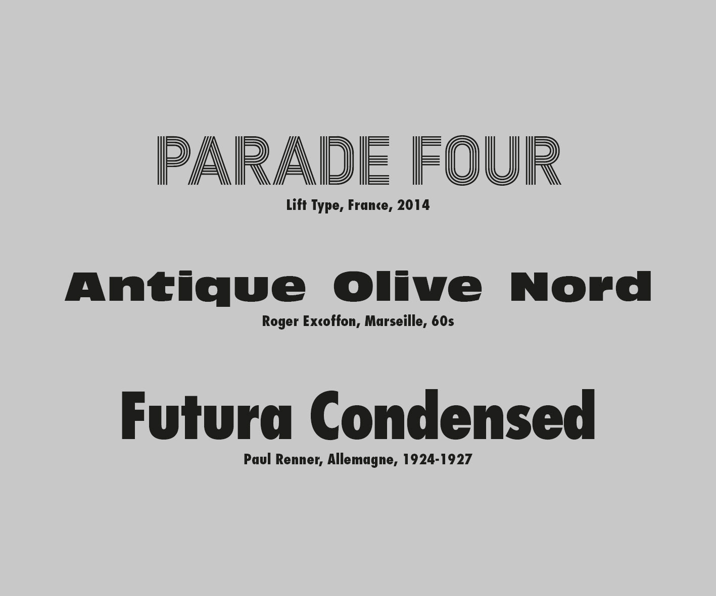
Parade Four is designed by Lift Type, a small type design studio between Montpellier and Marseille, France. Members of the studio are Romain Oudin, Nicolas Aubert, and Mathieu Mandin. Romain was a student then a teacher at ECV Aix-en-Provence, France (I studied there), as long as Mathieu, who was one of my teachers in third year. Parade Four directly came to my mind when I thought of 1969, as it is (partly) inspired from Mexico Olympics in 1968.
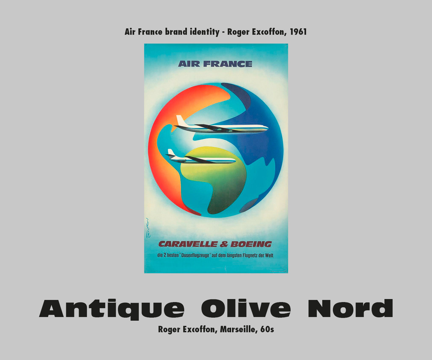
Antique Olive Nord was designed by Roger Excoffon... in Marseille! I love this typeface. It was used by Air France till the airline's rebranding in 2009, and is still one of the strongest fonts for titles.
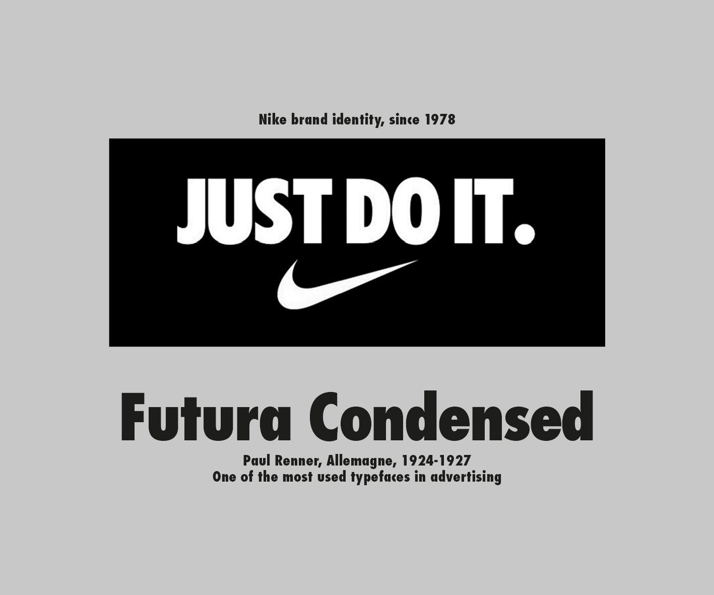
Do I need to introduce one of the most used typefaces of type History? It's the reason why I've used it. :)
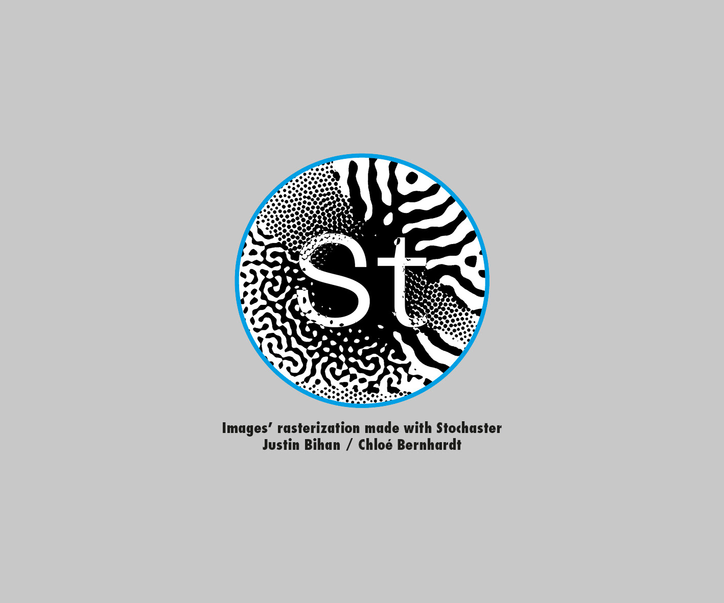
The pictures on the poster have been rasterized through Stochaster, a really good software developed by Justin Bihan and Chloé Bernhardt. Go check it!
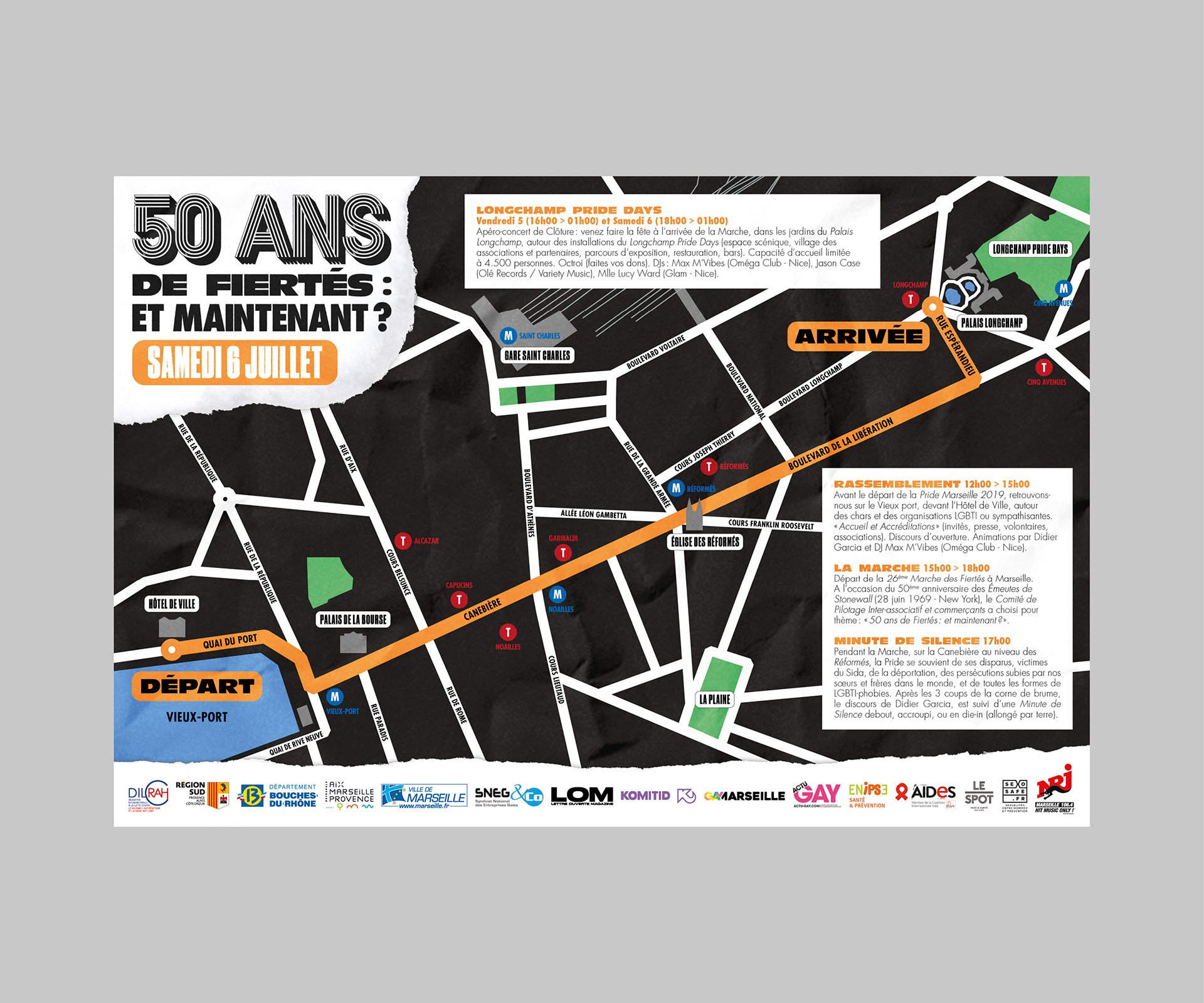
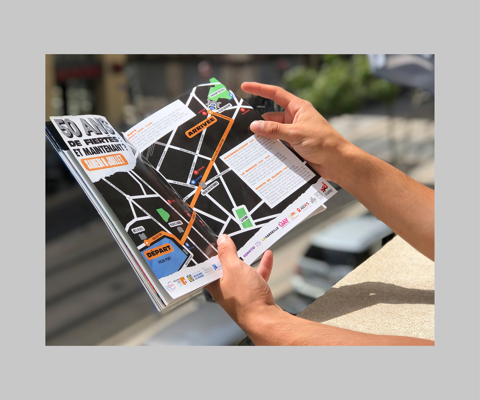
Digital version of the program available here: http://bit.ly/pm2019prog
Art direction and creation: Gael Lapasset, 2019.